Let's fix the Cubs' most pressing issue
Problems are arising already, but here's one important solution at least

Read Pointless Exercise in the Substack appAvailable for iOS and AndroidGet the app
It’s still early in the spring, but the Cubs already have issues.
Seiya Suzuki showed up all hulked out from an offseason of lifting weights and gettin’ swole and predictably, he’s already hurt himself.
The Cubs announced he’d gotten an MRI to get a better look at his oblique strain, and the same dopes who couldn’t read his finger x-ray last year will no doubt be similarly befuddled by this.Justin Steele pitched the most innings of his professional career last year (119), more than 20 more than his previous career high and 35 more than he did last year. But 119 isn’t really that much. Well, he was scratched from what was supposed to be his first spring start with “general arm fatigue.” General Arm Fatigue was by far my least favorite GI Joe action figure. Yes, even worse than Banzai and his weird pink S&M mask.
They’re still trying to make Nick Madrigal a thing at third base.
Nick Madrigal fields his first two attempts at 3B.
— Marquee Sports Network (@WatchMarquee) 8:20 PM ∙ Feb 26, 2023He’s like an even smaller Ron Cey over there. You expect to hear a little high pitched grunt when he has to jump to get enough momentum to make a 100 foot throw across the diamond.
But you know what? We can’t solve all of the Cubs problems on the fourth day of spring training games. But we can solve a long-running one that annoys us literally every minute of every game on Marquee.
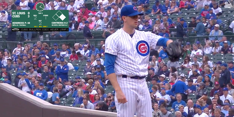
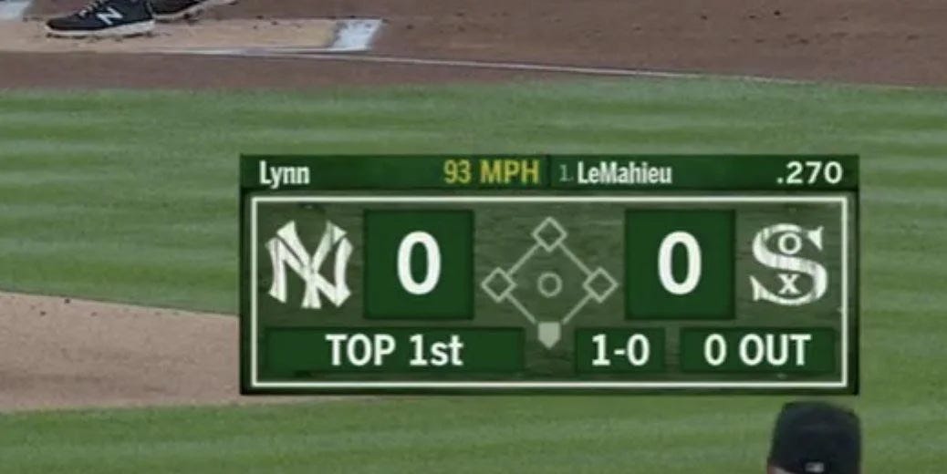
Let’s fix the Cubs terrible scorebug!
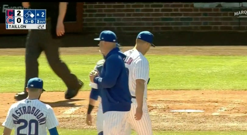
There it is, from yesterday’s ass-whuppin’ by the Guardians. It’s up there in the left hand corner perfunctorily providing us with the bare minimum in terms of info and aesthetics. But it’s worse than that because why is there a fucking pitch clock on it? Seriously, are they really going to put that thing on it all season long? Who asked for this?
Anyway, I’m going to redesign their scorebug for them and once you see it you are really going to hate the one they have now.
By the way, you know who has nearly the exact same scorebug as the Cubs?
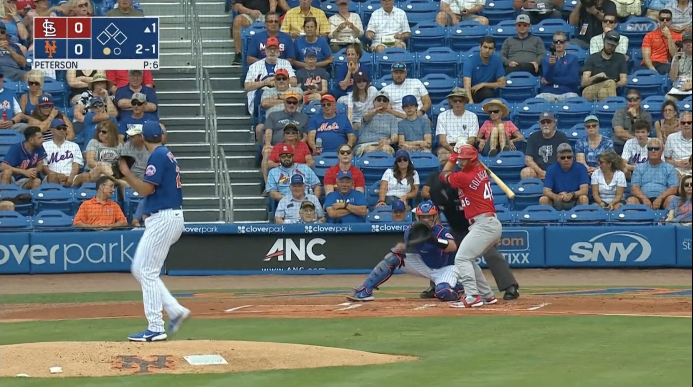
The Mets. It’s basically identical. The Cubs is squattier than the SNY version and Marquee bolds that awful, boring font, probably to make it easier for the Prevagen crowd to see it.
If you were going to steal somebody’s design why would you steal one that’s so dull?
In essence, Marquee’s current graphics package is designed to give you the feel of a national broadcast. A very low quality national broadcast. Maybe a national broadcast from Czechoslovakia. It’s all dumb and bad.
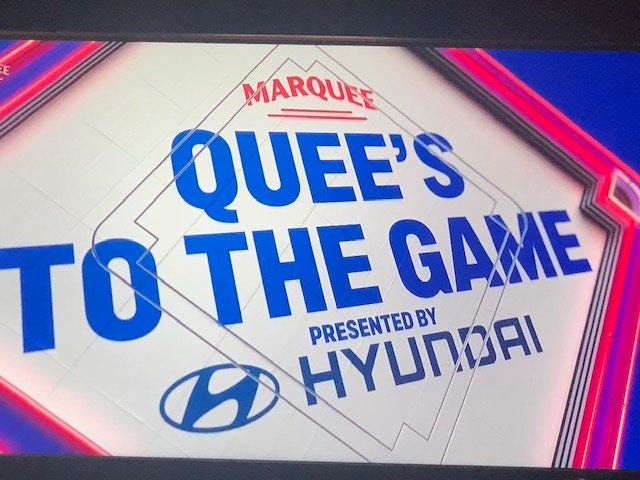
They still have that laughable ‘Quees to the Game thing. Remember when they couldn’t figure out where to put the apostrophe?
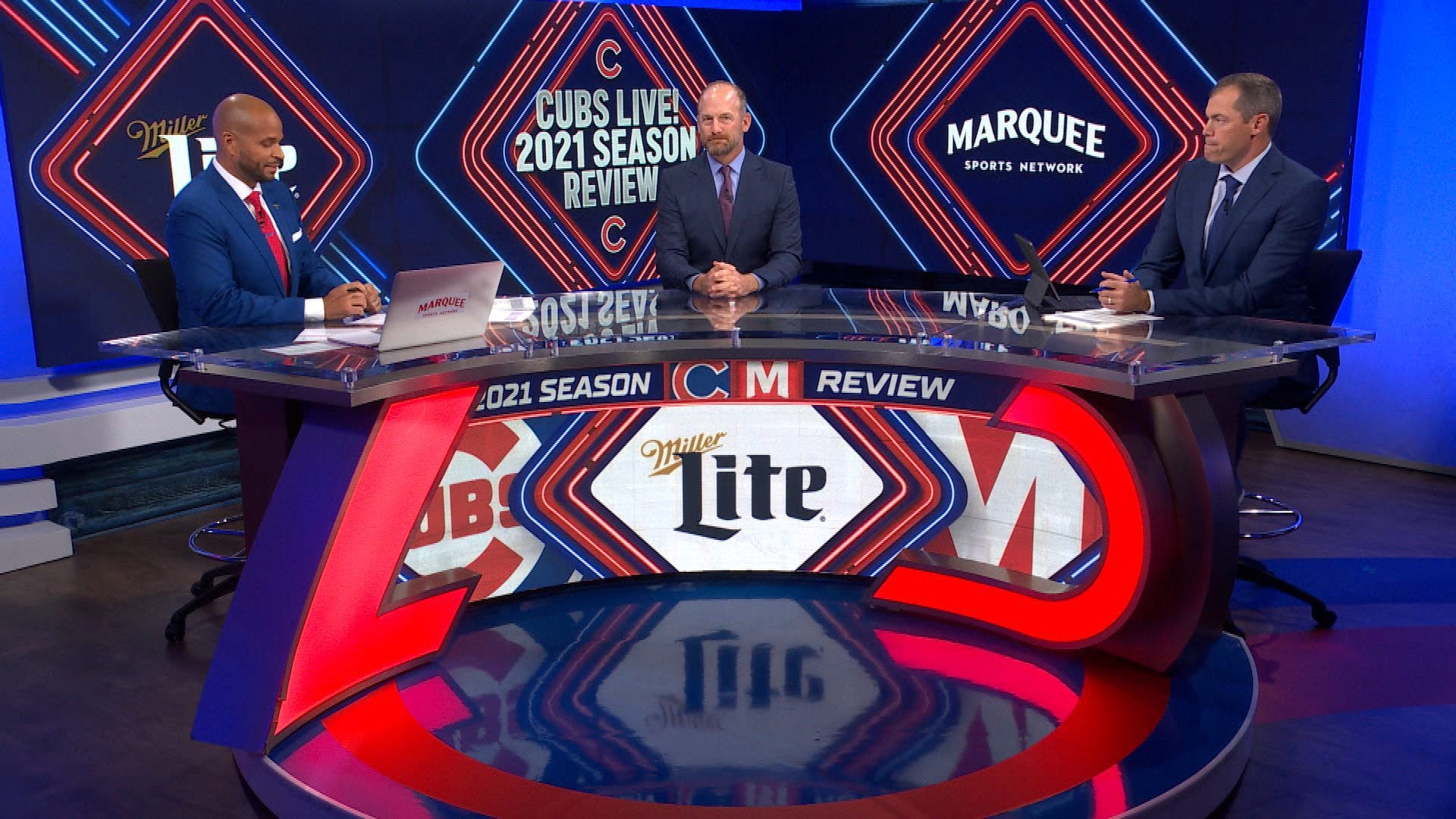
And why is there so much neon? Everything has that awful pinkish-red flashing crap all over it. Their pre and postgame set is awash in neon garbage all the time. I think it’s to distract you from how boring all of the content is.
The network name is nonsensical. Why would you start a network devoted to one specific team and then not work the team name into it at all?
A little light was shone on their thinking process during that awful self-aggrandizing video they debuted to pat themselves on the back for saving Wrigley just days after they traded every good player (except Willson Contreras and Kyle Hendricks) in July 2021.
In it, Crane Kenney talks about the planning process for the renovations and that their highly paid consultants told them the things they had to save were the marquee on the outside of the stadium, the ivy on the outfield walls and the hand operated scoreboard in center field. Nothing about the urinal troughs, I guess.
The Cubs did save all four of those things, and they became so enamored with their marquee that they named the network after it.
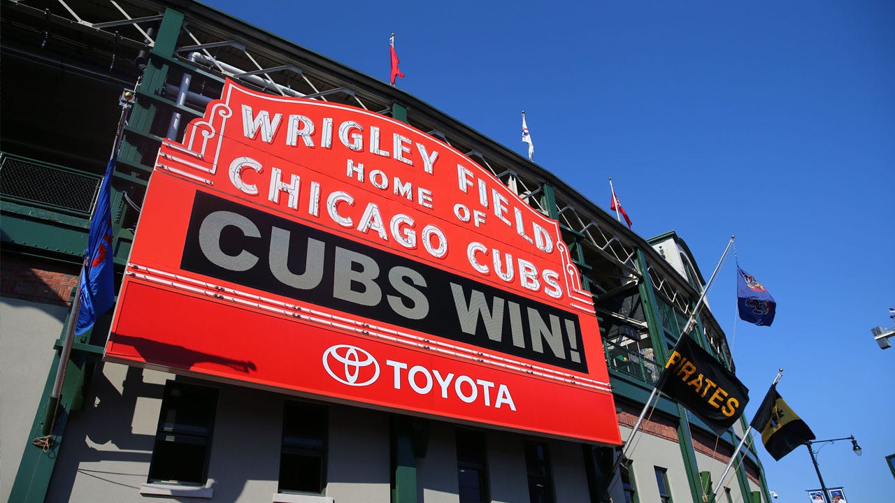
That’s fine. The marquee is iconic and cool and I’m glad they kept it. Name the network after it, whatever.
But other than the troughs and the ivy the other iconic thing they had to save is probably the most famous scoreboard in sports, right?
Did you know people are actually in the board and they manually change those tiles?
I know. They never talk about it.
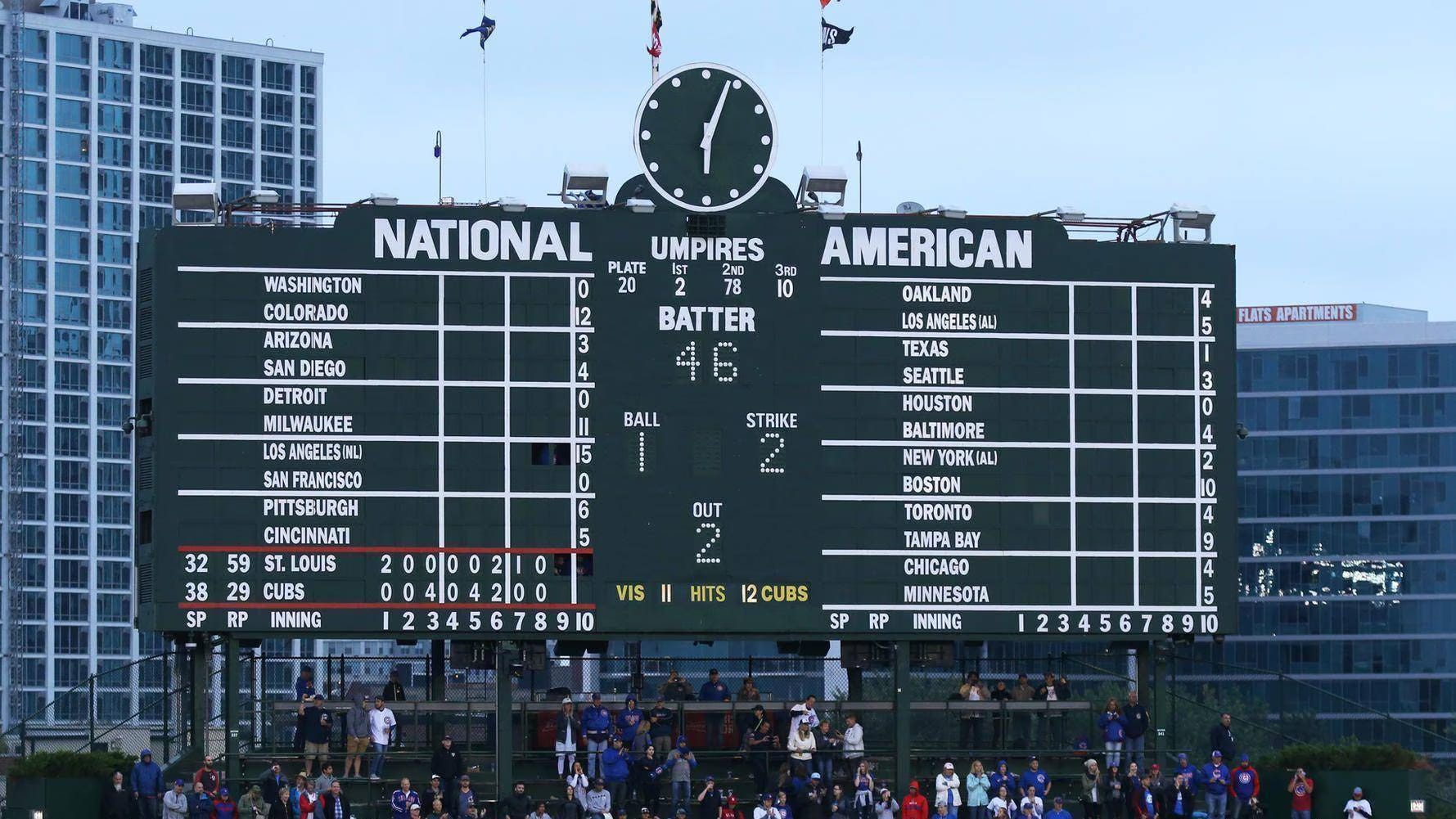
Look at this thing. It’s perfect. It has everything you need. Well, not everything, there’s only room for 11 out of town scores at any one time which means three games get left off. But who gives a shit about the (looks at the photo to figure out who’s not on it) Mets, Phillies, Marlins, Barves, Guardians, and Royals, anyway?
It forces you to do math because they don’t total scores until after games are done. The person who runs the balls and strikes is so fast that you cannot watch the pitch to the plate and then turn your eyes fast enough to see the number change on the board. They don’t use zeroes for balls, strikes or outs. It’s blank until it gets to one. That spot in the middle of the batter, ball, strike, out diamond displays an E or H when the official scorer botches a call.
So if the Cubs are so into the unique things of their ballpark why doesn’t their scorebug have any of the touches of the most famous scoreboard in sports?
It was really galling when Fox managed to whip up a far superior version for the Field of Dreams games that they’ve only ever used twice.
The animation even looked like a tile was being replaced whenever the score changed.
Anyway, if Fox can throw that thing together for two games, Marquee can certainly use the month before opening day to use something like the one I designed for them. They can pay me in cash. I don’t mind.
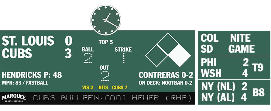
Here it is. Tell me you wouldn’t rather have this thing parked in the upper left hand corner of your TV for three hours-plus every day.
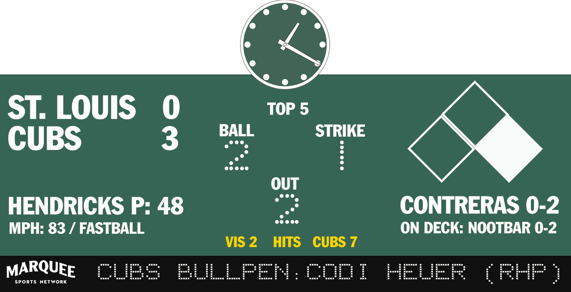
If you’re going to put a clock on anything, put the Wrigley Field scoreboard clock on it and program it to actually show Chicago local time, just for the hell of it.
But there it is, the score, who’s pitching, how many pitches he’s thrown, the speed and type of the last pitch, the count, the outs, the inning, what bases are occupied, and the batter. And none of it has to disappear to show anything else.
Why not add the hits in yellow like they do on the real scoreboard (you don’t need it, but it’s cool, and things should be cool)? And wouldn’t it be nice to always see who is on deck?
And, I even added the old ribbon board that used to be under the scoreboard and they could put things on it that they never bother to tell or show us during games, like who’s warming up in the bullpen.
Don’t you think this would be better?
And how about this? Why not have a little out of town scoreboard pop out next to it once and a while?
A little W flag could fly above the clock when the Cubs actually win a game.
I know, it’s crazy. Why would you want to incorporate one of the most iconic things about your franchise into your broadcasts? Why would you want to try to be different when you can just throw up the free graphics your intern stole from SNY on a flash drive four seasons ago?
I’m sure the graphics whiz’s over there with the Cubs can take this and make it look even better. Right?
Anyway, now that you see it, you want it. Or at least something like it.
Don’t you?
You’re welcome.